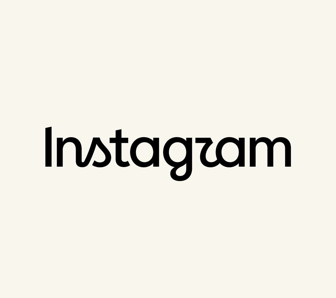
Meta unveils a sharper, more modern Instagram wordmark that updates the app’s primary typography for the first time in 10 years, while the gradient camera logo remains unchanged.
Instagram has introduced a redesigned wordmark logo for the first time in more than a decade, marking a significant but deliberately restrained refresh of its visual identity. Announced by Instagram head Adam Mosseri on Instagram and Threads, the new Instagram wordmark updates the familiar script lettering while preserving the platform’s signature pink‑purple camera icon and overall brand colour palette.
Instagram’s First Wordmark Refresh in 10 Years
The change, rolled out on Thursday, is Instagram’s first major typography update since around 2016, when the company last overhauled its broader look and iconography. At that time, Instagram moved away from its original brown retro camera with a rainbow stripe to the bright gradient camera icon that has since become one of the most recognisable app symbols in the world.
“The wordmark at the top of the app hasn’t changed in 10 years, so it was time for a refresh,” Mosseri wrote in a post introducing the new design. The updated wordmark appears across the app’s interface, marketing materials and brand channels, replacing the previous cursive logo that had remained essentially static even as the product and company evolved.
Meta and Instagram describe the refresh as part of an effort to modernise the brand’s core typography without confusing users or diluting hard‑won brand recognition. Crucially, the iconic gradient camera logo — the app icon users see on their phone screens — remains completely unchanged.
What Has Changed in the New Instagram Wordmark?
The new wordmark retains Instagram’s signature script style, but with redrawn letterforms and a slightly sharper, cleaner look. Observers and design blogs note that:
-
The strokes of the letters are more consistent and refined, giving the logo a crisper appearance at both small and large sizes.
-
Curves and connections between letters have been adjusted to create better legibility and balance, particularly in digital contexts where the logo often appears at compact widths.
-
The overall silhouette of the brand name remains familiar, helping maintain continuity with Instagram’s longstanding visual identity.
Mosseri described the new wordmark as “cleaner and more modern, with references to the original and the simplicity and craft that’s always made it Instagram.” Industry coverage emphasises that the change is evolutionary rather than revolutionary — a kind of typographic tune‑up rather than a full rebrand
Camera Icon and Core Brand Colours Stay the Same
One of the most notable aspects of the refresh is what hasn’t changed. Instagram has confirmed that the gradient camera icon introduced in 2016 and now used globally — a stylised camera outline over a pink‑orange‑purple gradient — is not being modified as part of this update.
BestMediaInfo and other outlets report that Instagram’s broader visual system, including the gradient colour palette and key UX elements, remains intact, with the wordmark update focused squarely on the typography at the top of the app and in brand contexts. The decision reflects Meta’s awareness that the camera icon is core to Instagram’s recognition and equity, and that changing it could risk user confusion or pushback.
User Reactions: “Instagzam” Jokes and Mixed Reviews
Initial user reactions to the refreshed wordmark have been mixed, ranging from approval to playful criticism.
According to ANI and TechCrunch:
-
Some users welcomed the logo as “sharper and more modern,” praising the subtle evolution and Mosseri’s emphasis on craft
-
Others expressed disappointment, arguing that the tweaks feel unnecessary or that they preferred the quirkier, softer look of the previous script.
A recurring joke across social platforms is that the wordmark now reads as “Instagzam” rather than “Instagram,” due to the way the redesigned “r” connects into the following “a”. The new letterform makes the “r” look somewhat like a “z” to some viewers at a glance, especially in smaller renderings.
Design commentators point out that such legibility debates are common when high‑profile brands adjust logotypes even slightly. Early criticism often fades as users acclimate, while brand teams weigh feedback against technical and aesthetic goals like screen readability, localisation support and consistency across devices.
Why Instagram Is Updating Its Wordmark Now
Meta has not framed the update as a rebrand or strategic pivot, but several factors help explain the timing and focus of the change:
-
Brand age and platform maturity
Instagram is now more than 14 years old and has shifted from a niche photo‑sharing app to a core part of Meta’s ecosystem, supporting Reels, messaging, commerce, creator tools and more. A decade‑old wordmark sitting atop an increasingly complex and modern interface was an obvious candidate for refinement. -
Typography and scalability across screens
As devices and UI frameworks have evolved, brands have refreshed logos to ensure they render cleanly on high‑DPI displays, small screen widths and varied UI themes. Redrawing the script helps Instagram maintain legibility in everything from app headers to marketing materials and partner integrations. -
Consistency with Meta’s broader design language
Meta has slowly harmonised aspects of its visual system across apps like Facebook, WhatsApp and Instagram, while preserving distinct identities. A cleaner, slightly more geometric script for Instagram is more in line with modern UI typography and Meta’s design direction, without sacrificing the playful, creative tone associated with the platform.
By limiting the refresh to the wordmark and leaving the camera icon untouched, Instagram balances continuity and modernisation, signalling that the brand is evolving but not abandoning the look users recognise.
How the New Instagram Wordmark Fits Into Instagram’s Brand Strategy
Media and branding analysts see the wordmark update as part of a broader identity maintenance strategy rather than an attempt to reposition the product.
-
The updated logo will appear across in‑app surfaces, websites, advertising, and partner communications, offering a single, unified signature for the Instagram name.
-
The script retains a handwritten feel, which aligns with Instagram’s role as a home for creators, everyday expression and visual storytelling, while sharpening the forms to match a platform that now includes serious commerce and professional content.
-
By emphasising simplicity and references to the original, Mosseri and Meta are signalling that Instagram’s core brand promise—creative sharing, community and visual culture—remains the same, even as the app continues to experiment with features like Reels, Notes and AI tools.
At the same time, Meta’s decision to publicise the refresh with executive commentary and tech‑press briefings underscores how large platforms treat even modest logo changes as newsworthy events, aware of user attachment to visual identity and the potential for confusion if changes appear without explanation.
What Users and Brands Should Expect
For everyday users, the practical impact of Instagram’s wordmark refresh is minimal:
-
The camera icon on smartphones remains the same, and the app’s core functions are unchanged.
-
The principal difference is the script “Instagram” label at the top of the app and in marketing materials, which now appears in the refined lettering.
For brands, creators and designers who work with Instagram assets:
-
Official brand kits and documentation will update to the new wordmark, and partners are likely to be encouraged (or required) to adopt it in co‑branded materials to keep visual consistency.
-
Any design templates that include the old script logo may eventually need to be refreshed, particularly in high‑visibility campaigns or integrations.
In branding terms, Instagram’s refreshed wordmark is a small but symbolic step: a reminder that even dominant digital platforms periodically revisit their visual foundations, tweaking typography and marks to keep pace with evolving design standards and user expectations, while leaving the heart of the brand — in this case, the colourful camera icon and the idea of everyday visual sharing — firmly in place.